Edit May 2016: Corrected false information about Adobe Illustrator and Tableau Public. Edit June 2017: Added the Datawrapper version of the bubble chart.
Which tool or charting framework do you use to visualize data? Everybody I’ve met so far has personal preferences (“I got introduced to data vis with that tool!”, “My hero uses that tool and she makes the best charts!”). Often we keep working with the first not-entirely-bad tool or language that we encountered.
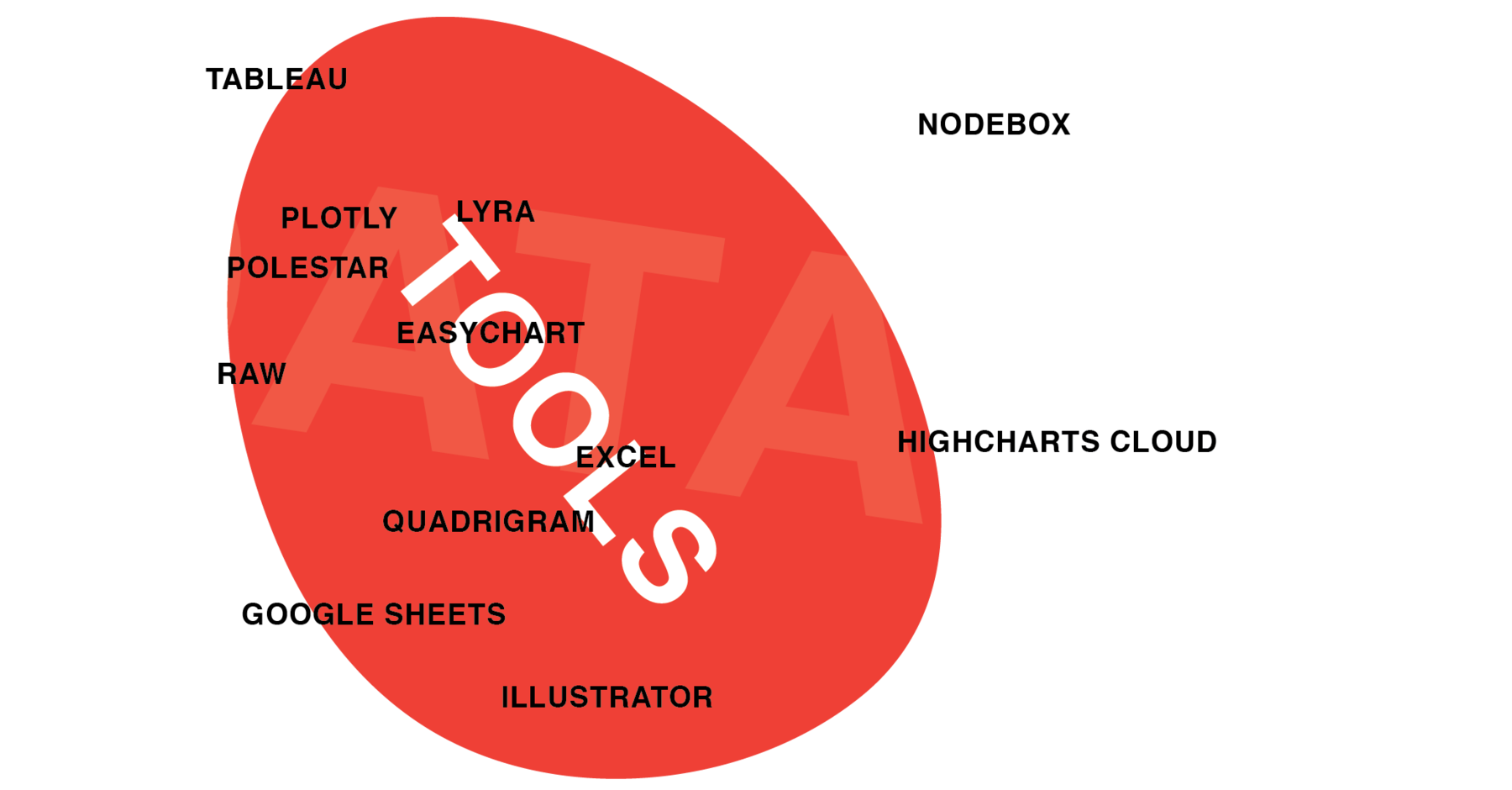
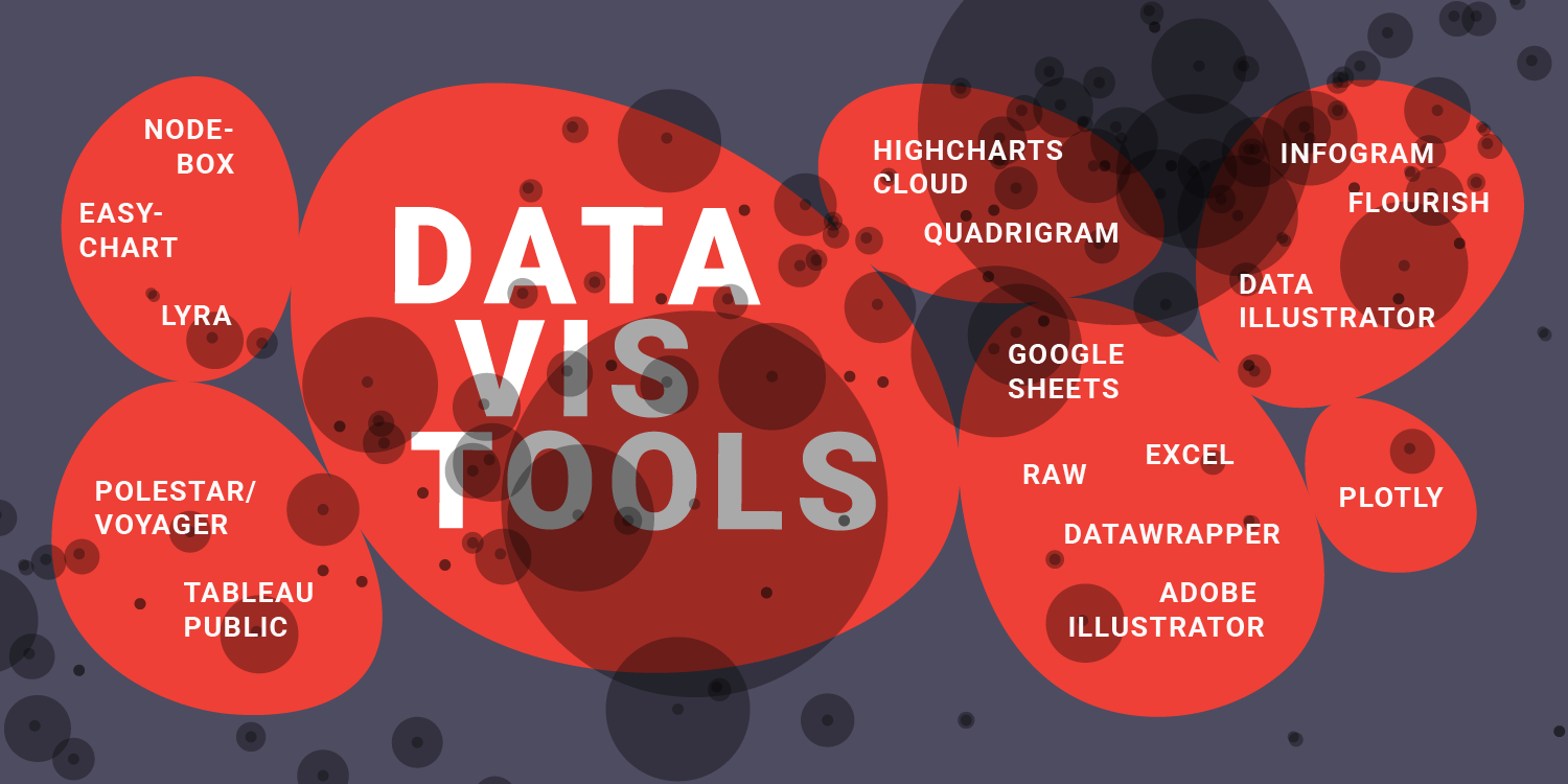
I think it can’t hurt to have a wider view of the options out there: To maybe discover better tools than the ones we use; but also to reassure us that the tools we use ARE really the best (so far). That’s what this post and the next post is about. I wanted to get to know as many options to visualize data as possible. To do that, I took the same dataset and visualized it with 12 different tools (this post) and 12 different charting libraries (next post).
If they are important tools I missed, or if I missed some features in a tool or a better way to get to the bubble chart, or if I’m wrong about a thing or two, or if you completely disagree with my opinion about these tools (which, I’m sure, will happen): Let me know on Twitter or via email (lisacharlotterost@gmail.com)!
The Data & the Visualization Form
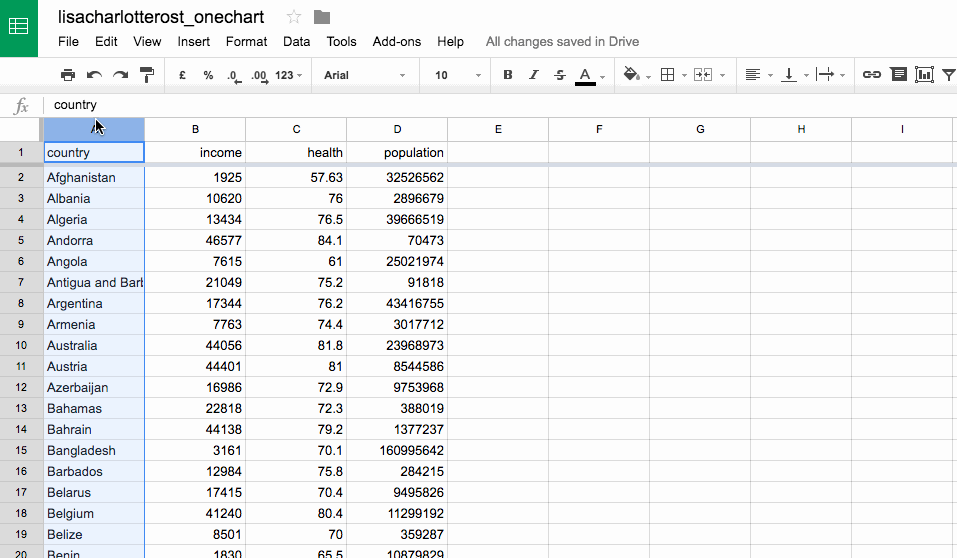
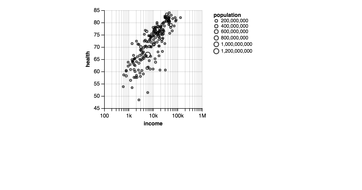
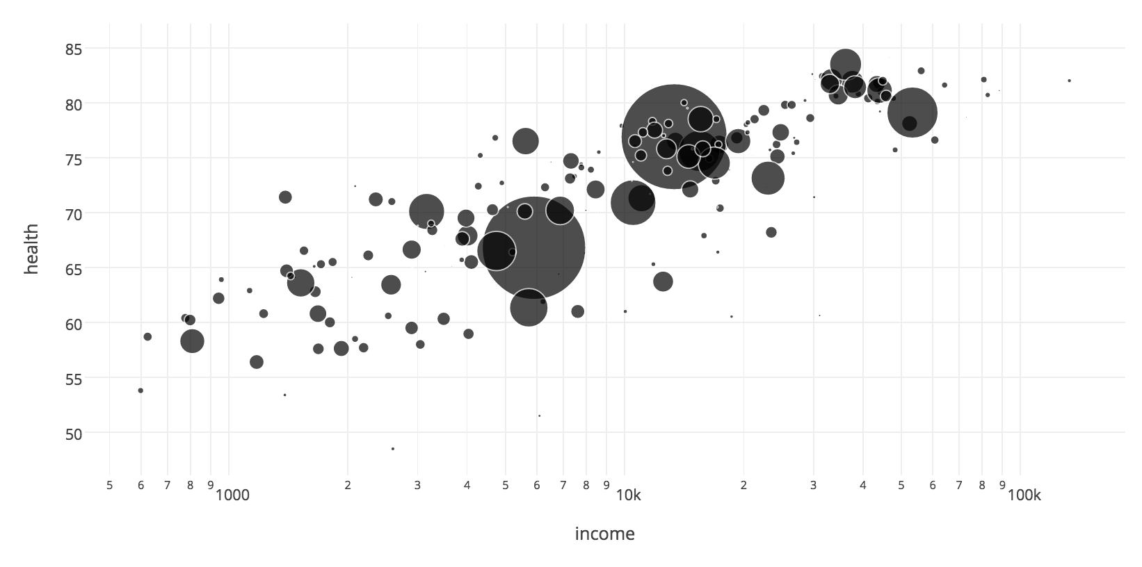
To visualize data, you need data. I will use a dataset that contains the health expectancy in years, GDP per capita and population for 187 countries in 2015, provided by Gapminder. Here’s a Google Spreadsheet with the data:
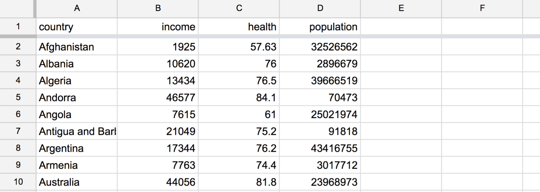
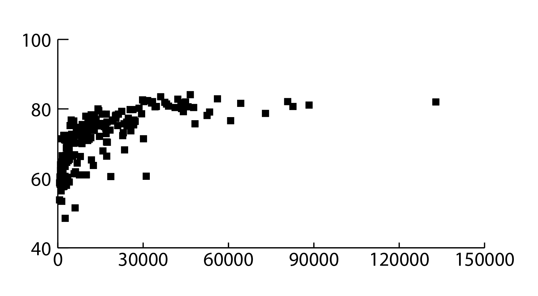
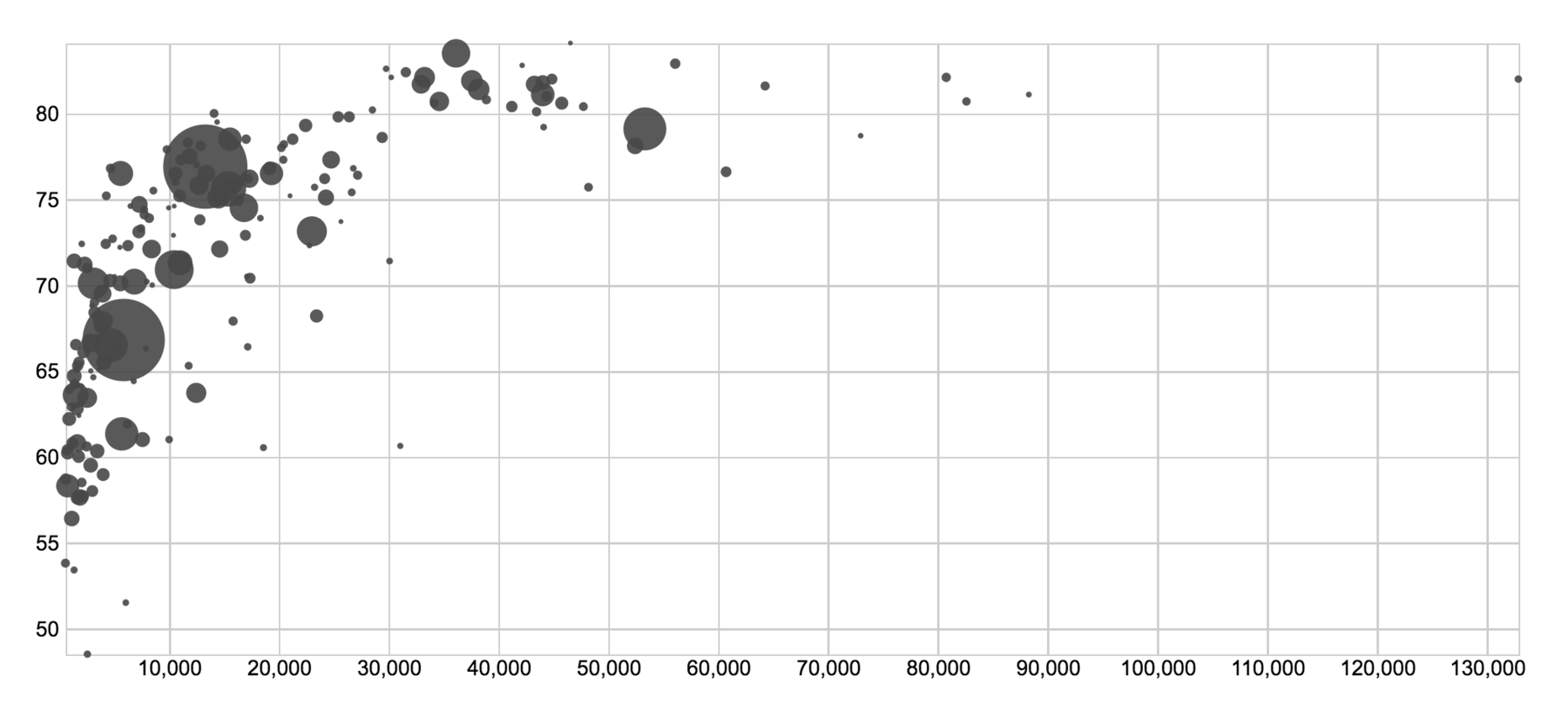
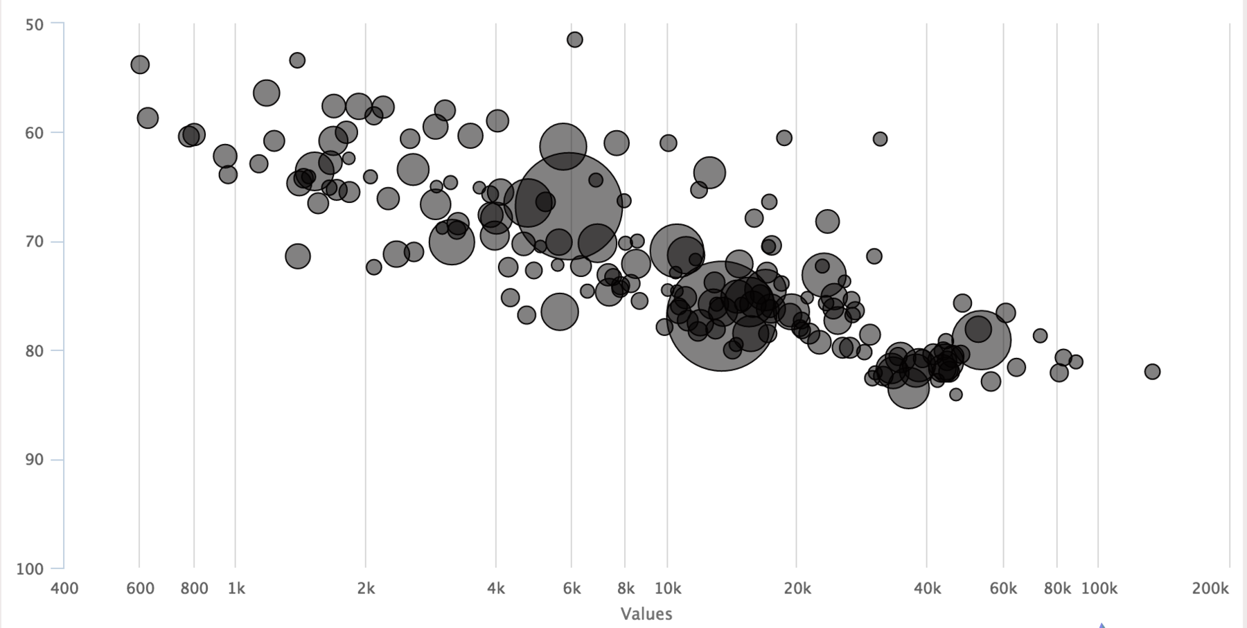
I will try to visualize the data in the same form Gapminder does: On the x-axis, I want the GDP per capita (“income”). On the y-axis, I will put the health expectancy in years (“health”). And the size of the bubbles will represent the population of the country. Some tools call that a scatterplot, some call it a bubble chart.
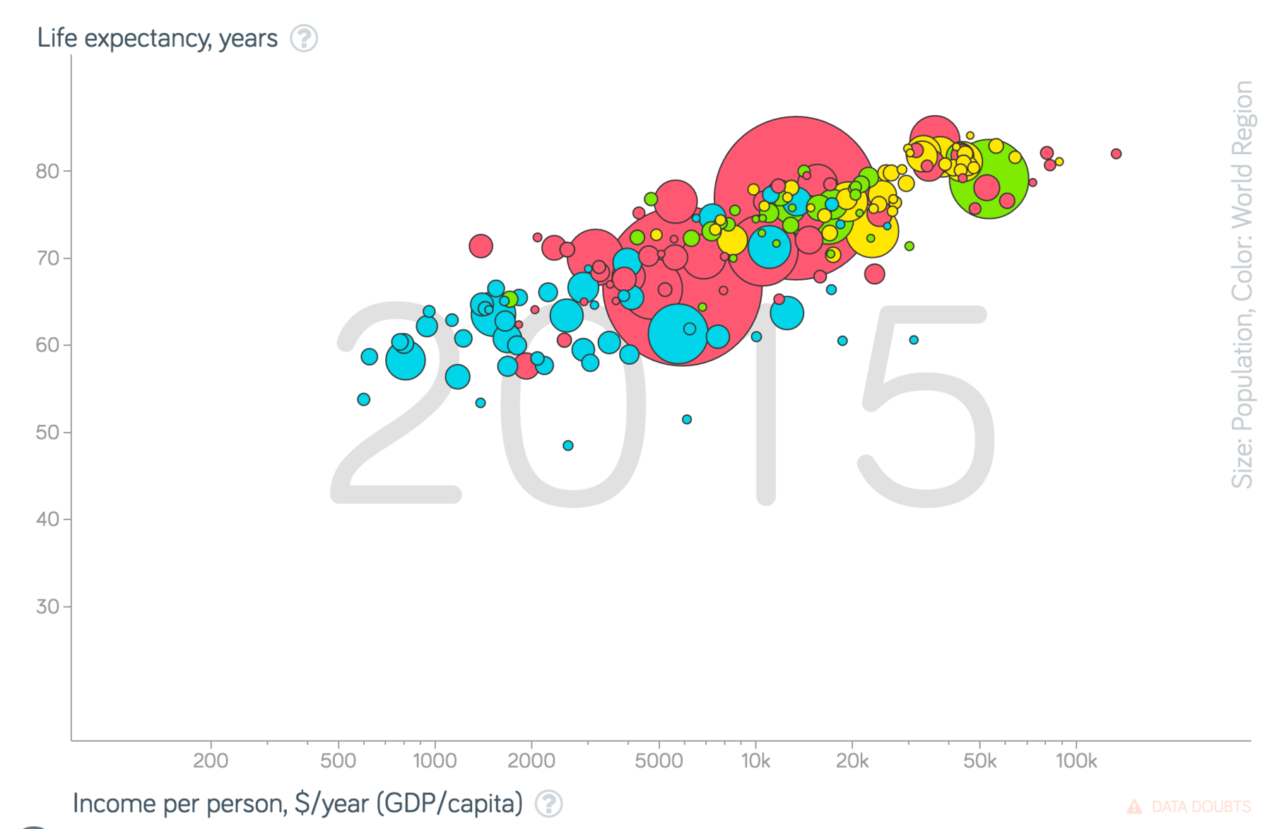
I chose that visualization form over a simple bar chart for multiple reasons: Setting the size of the bubble will show which tools are more advanced. Also, we want the x-axis to start at 0 and be log-scaled. Let’s see which tools can handle that.
Please be aware that I will only use tools and programming languages that make sense for my data and not networking tools like Gephi. Also, the statements I make about the tools and languages are only true for the dataset I chose and definitely influenced by my past experience with the tool.
Some rules: I will try to reproduce that Gapminder chart as good as possible, but I won’t tweak the design more than the tool allows. Eg. in Illustrator, I will only use the chart tool, not the thousands of design options. Also, I won’t tweak the csv beforehand. The csv will stay like it is. Yihaa, let’s go!
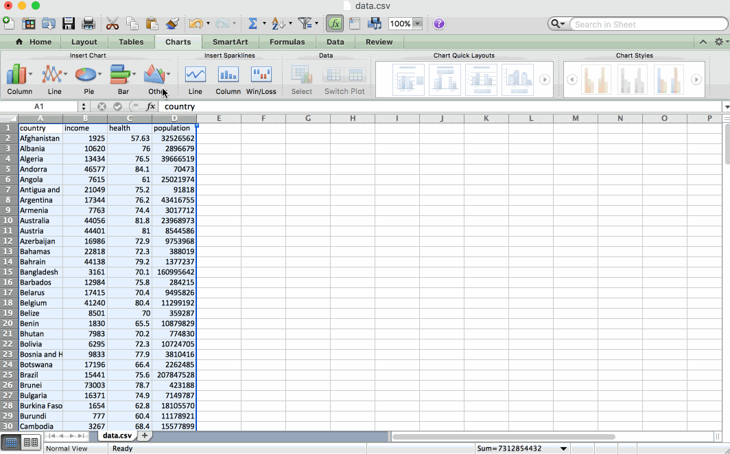
Excel
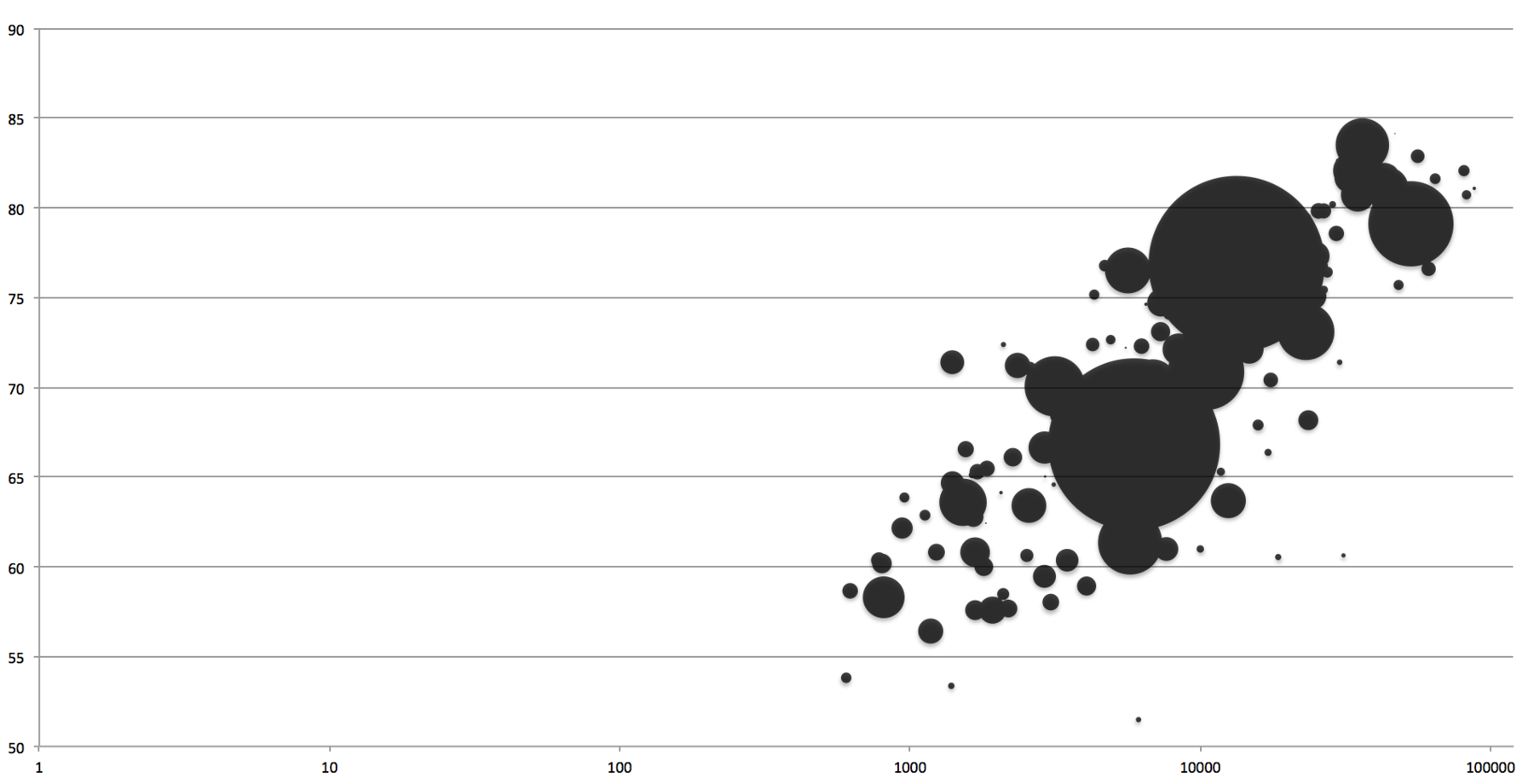
We start with the most common software to use charts. It’s also responsible for the most complicated process to get to this scatterplot of all my tools. After finally figuring out how to assign columns to axises, I couldn’t find a way to make the bubbles feel NOT like one big black merged cheese hole something. The option “Vary color by point” (I had all my hope on it) gives all bubbles an individual (very colorful) color. Hm. That said, Excel did an excellent job with the axises.
Google Sheets
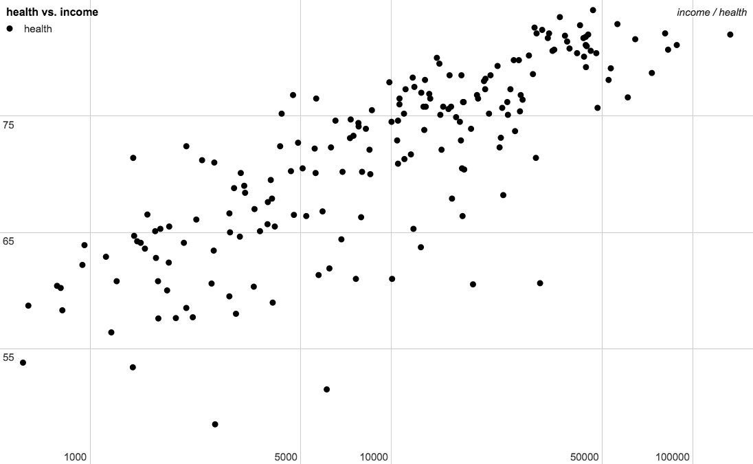
Google Sheets is my favorite spreadsheet app out there (so far). On a Mac at least, it just works smoother than Excel. Also, it’s far less complex and powerful than Excel, but “good enough” for the daily stuff I do in spreadsheets (split, unique, countif, ifelse, vlookup, max, average, median, simple math and pivot tables, because I loooove pivot tables). Google Spreadsheets CAN do bubble charts, but only with a little hack - I would have needed to change my data for it.
Adobe Illustrator
Ah, Illustrator. A tool that almost every Information Designer uses for static designs, daily. Let’s be precise here: The charting options in Illustrator suck. For example: Illustrator can’t do bubble charts. Also, there is no option to set the Y-Axis to Zero (if you want that, you need to include a row in your data in which you put a 0 and that you then delete in the chart). Also, there is no option to set an axis to log-scale (if you want that, you need to do so in your data). Also, Illustrator connects all the dots (which, to be fair, can be helpful in 5% of the cases). Sigh.
Edit: David Ingold showed me the way to set the origin to 0 and to disconnect the dots.
RAW by DensityDesign
I’d call RAW a super-easy-to-use extension for Adobe Illustrator: You can export fancy charts as SVG or PDF and then tweak them in Illustrator. For scatterplots, RAW does have the option to change the size of the bubbles and the option to set the origin at 0 – but only for both axises. Also, no log scale.
Lyra
I like Lyra. I’m a fan. It’s been around for quite some time, but it’s still buggy and I wouldn’t recommend it as the only tool one should use. But more than its execution I like its concept: Lyra treats every visual element and its size, height and width as something that can be manipulated by data - with simple dragging variables and scales on them. You can export your final graph as SVG, so it’s Illustrator-tweakable. Lyra is what Illustrator SHOULD be.
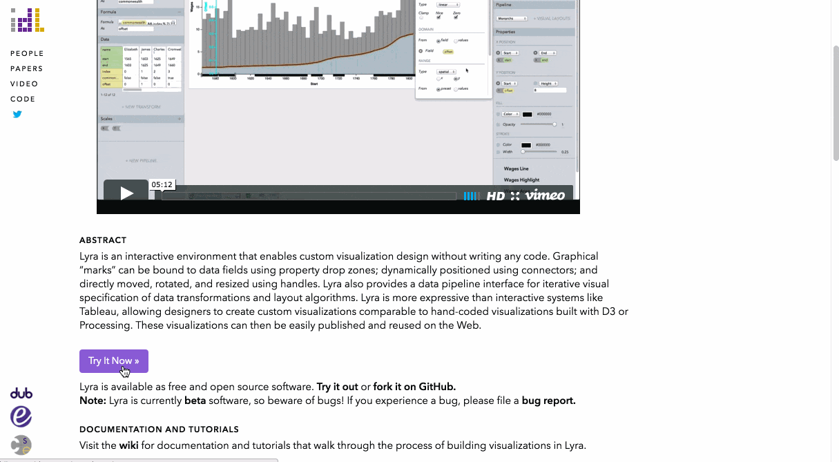
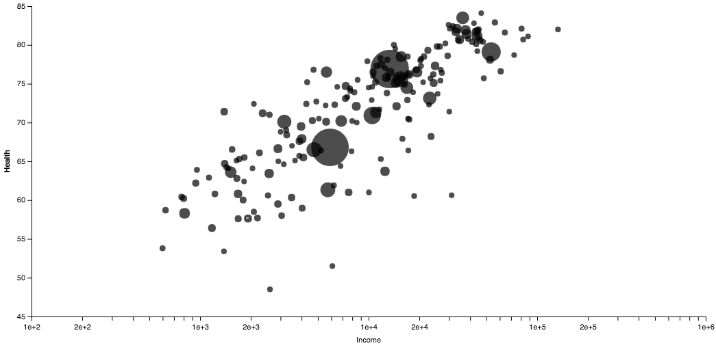
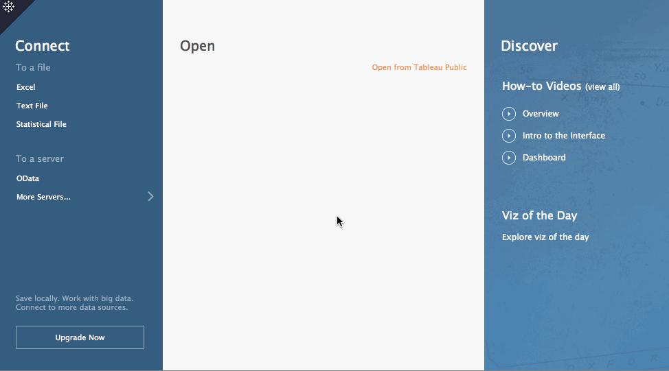
Tableau Public
What can I say - Tableau Public just works well for data like this. It’s too slow for my taste to use it for interactive graphs, and it’s a huge shame that it’s not possible to export SVGs or PDFs or anything, really, in the free version. But for exploration, it’s still one of my favorite tools.
Edit: Ben Jones explained that it’s possible to download an Illustrator-tweakable PDF of the chart after uploading it to the cloud. Needing to upload the chart is not awesome, but being able to export a PDF is pretty awesome and could have helped me a lot in the past. It turns Tableau into an Illustrator extension.
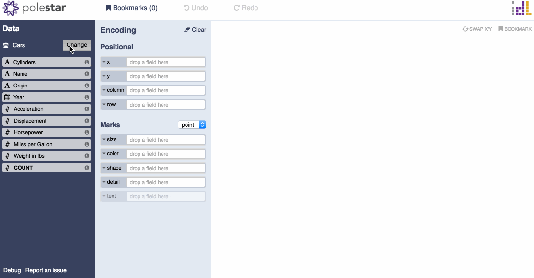
Polestar
Like Lyra, Polestar is a creation of the University of Washington Interactive Data Lab. Polestar uses Vega Lite, which is based on Vega, which is based on D3.js. Their creators call Polestar a “lightweight Tableau-style interface for visual analysis”. And it IS really lightweight (and still very alpha, as some glitches and the missing option to resize the graphic show). But I’m all up for a free, opensource (browser-ran) alternative to Tableau, so I really hope that the lab will continue working on it.
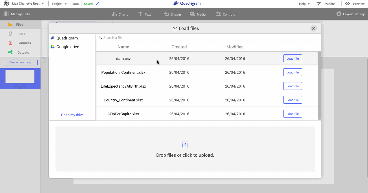
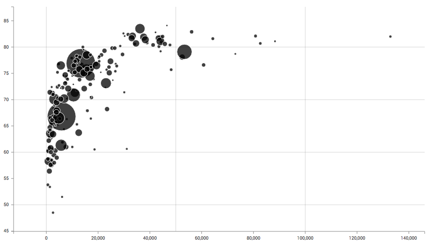
Quadrigram
Quadrigram is a story building tool, and one of their sub-features is to build charts. You need to connect with your whole Google Drive account to Quadrigram, which seems shady. Honestly, I wouldn’t have included it here, but Alberto Cairo seems to be a fan. And because you all follow Alberto, you’ve probably asked yourself the same question: What is he talking about? Quadrigram appears to be a very simplified version of Lyra. Works for simple stuff, but is a little bit confusing and doesn’t offer log scales. But here too, you can export an SVG.
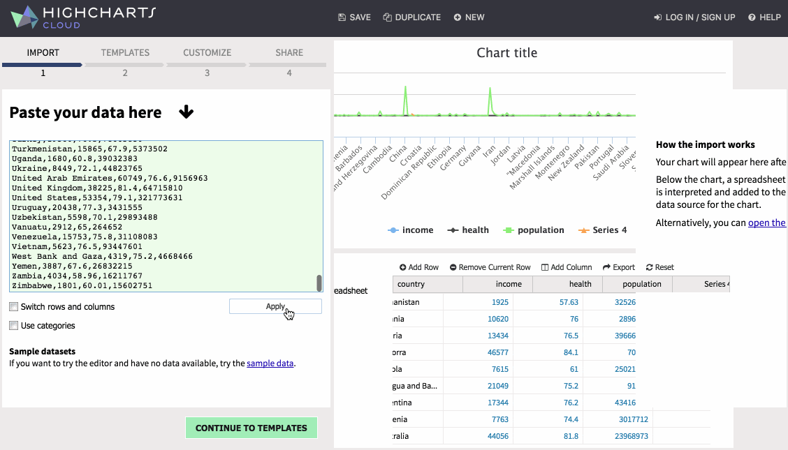
Highcharts Cloud
Highcharts is mostly known for their Javascript library, but after some time I figured out that they also have a click tool to generate charts: Highcharts Cloud. I was disappointed by the whole tool. It took me quite some time to figure out the following problems: 1) There is no way to assign variables to axises. Your data table needs to in the right order. 2) My “income” data wasn’t read as numbers, but as strings or categories, although Highcharts showed me that the data type is “numbers”. 3) “Invert Axises” inverts the axises, but also puts the y-axis upside down. But only the y-axis. Why? Nobody knows. 4) The range of my “health” column goes from 50 to 100, but Highcharts showed me the data on a 0 to 12.5k scale. Why? Again, nobody knows. I had to set the range manually.
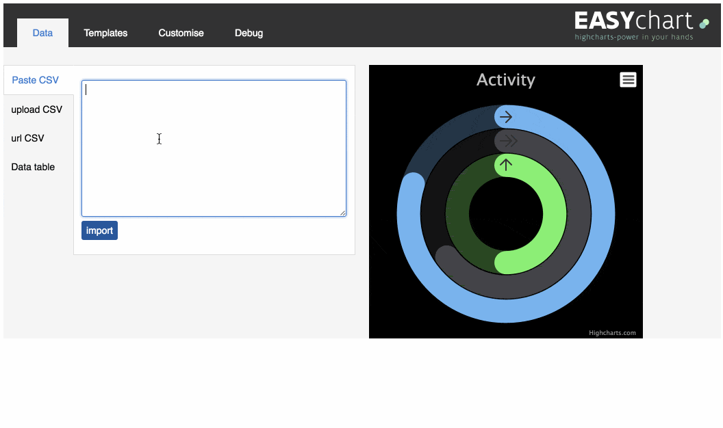
Easychart
Fun Fact: There is an interface for the Highcharts library which works far better for my data than the official one by Highcharts: Easychart. Here, too, it’s not possible to assign variables to axises, so I had to delete my “country” column. And there seems to be the option to set the origin to 0 – but the chart disappears when I do so. And still. I got the chart I wanted. I’m happy. And you can download the result as PDF and SVG, meaning, it’s Illustrator-tweakable.
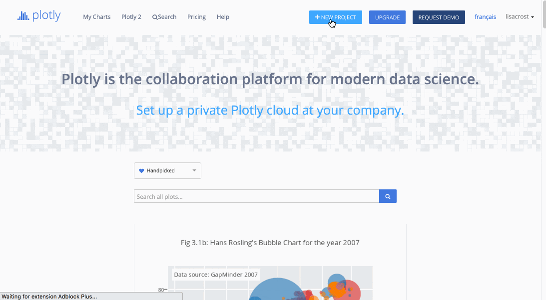
Plotly Like Highcharts, Plotly comes with a click-tool and a Javascript library. Oh, and a R library. And a Python library. And more, and everything well explained. And unlike Highcharts Cloud and Easychart, I was able to assign variables to axises. Everything can be so simple. Not gonna lie: I’m impressed. And Plotly released a better version of their click tool - unfortunately only for Pro users.
NodeBox
I first came across NodeBox in this Visualoop article. Seemed neat! Visual programming languages like NodeBox have my sympathy. But yeah, while working on the scatterplot, it was pretty obvious that it’s not made for simple Data Visualizations. Instead of directly assigning values to x and y of the ellipse, I had to first create “points” and then pass their coordinates to the ellipse. In which format that happens? Nobody knows. It took me some time to figure that out – so I was almost relieved to notice that it’s not possible to create axises in NodeBox. Which makes it also very hard to know WHAT you plot. Looks beautiful, though. If you want to run it for yourself, find the code on GitHub!

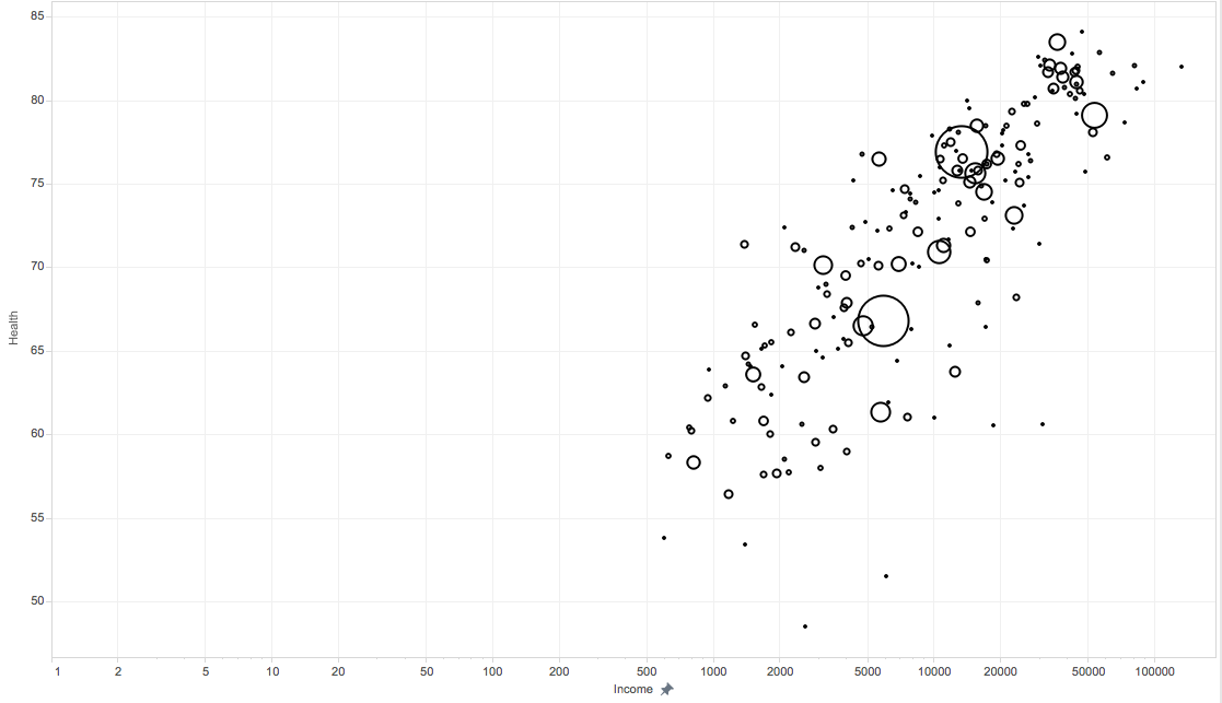
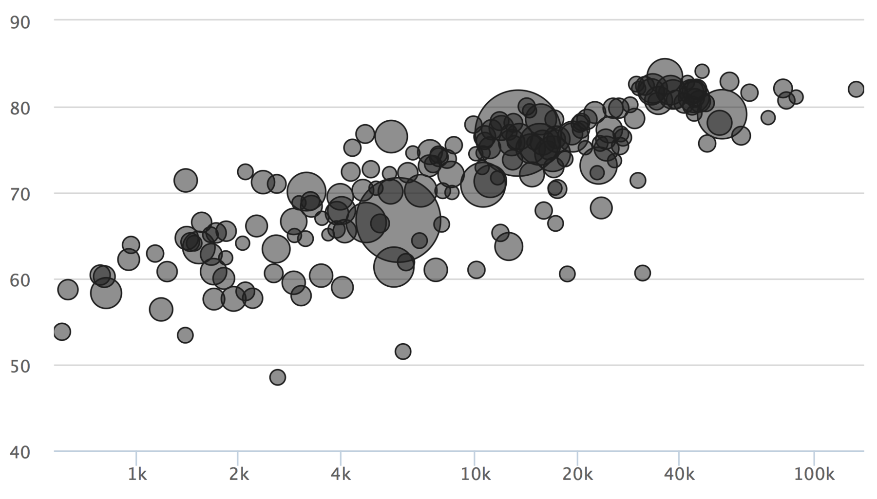
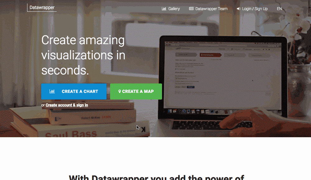
Datawrapper
Some of you might have noticed that I didn’t mention their beloved Datawrapper. This tool is one of the easier chart-clicky-tool out there and is used by many newsrooms. But it doesn’t offer scatterplots. The explanation I was given: Datawrapper is supposed to be for presentation only, and scatterplots are a presentation format that should be handled with care.
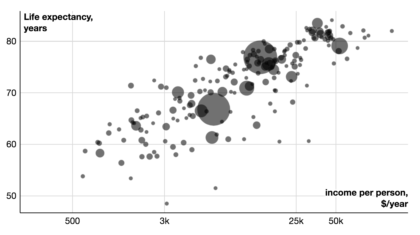
Edit: In March 2017, Datawrapper started to offer scatterplots as a chart type. The process for creating them works really well with my data. Datawrapper is one of the rare tools that automatically assigns my variables to the axes exactly as I intended to. I’m impressed that it even offers log scales, since it’s supposed to be a easy-to-use tool for editors (maybe log scales are too much for that aim? Not sure). And wow, I do love editing the axis labels directly in the chart. Convenient as heck.
That’s it! Let me know what you think on Twitter or via email (lisacharlotterost@gmail.com) (seriously, I love emails).
The many hours spent trying to understand all these tools were made possible by my Knight-Mozilla OpenNews fellowship at NPR. A big thank you to OpenNews, the NPR Visuals Team and the helpful comments at the GEN Data Journalism Unconference at the 10th of May in New York City.


Comments