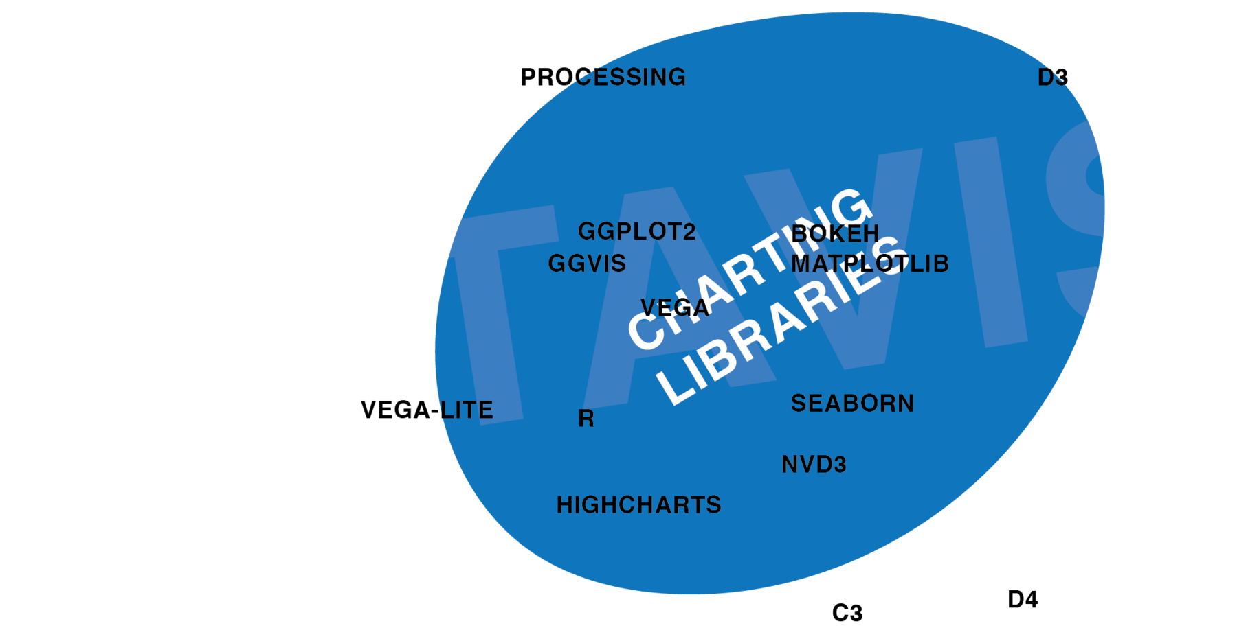
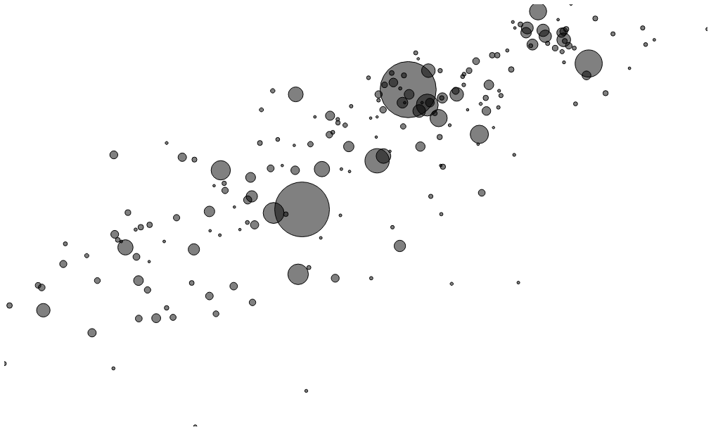
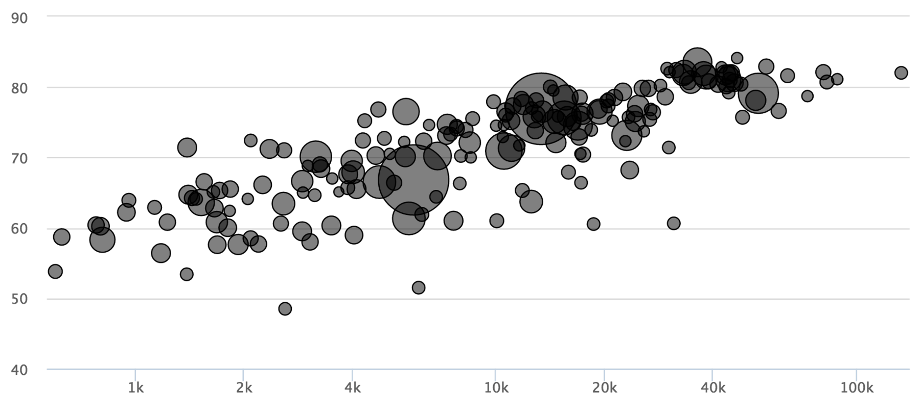
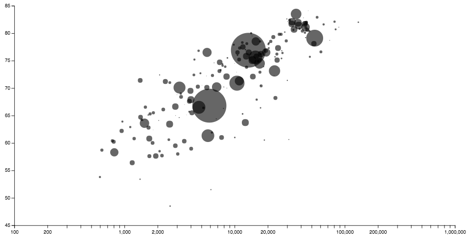
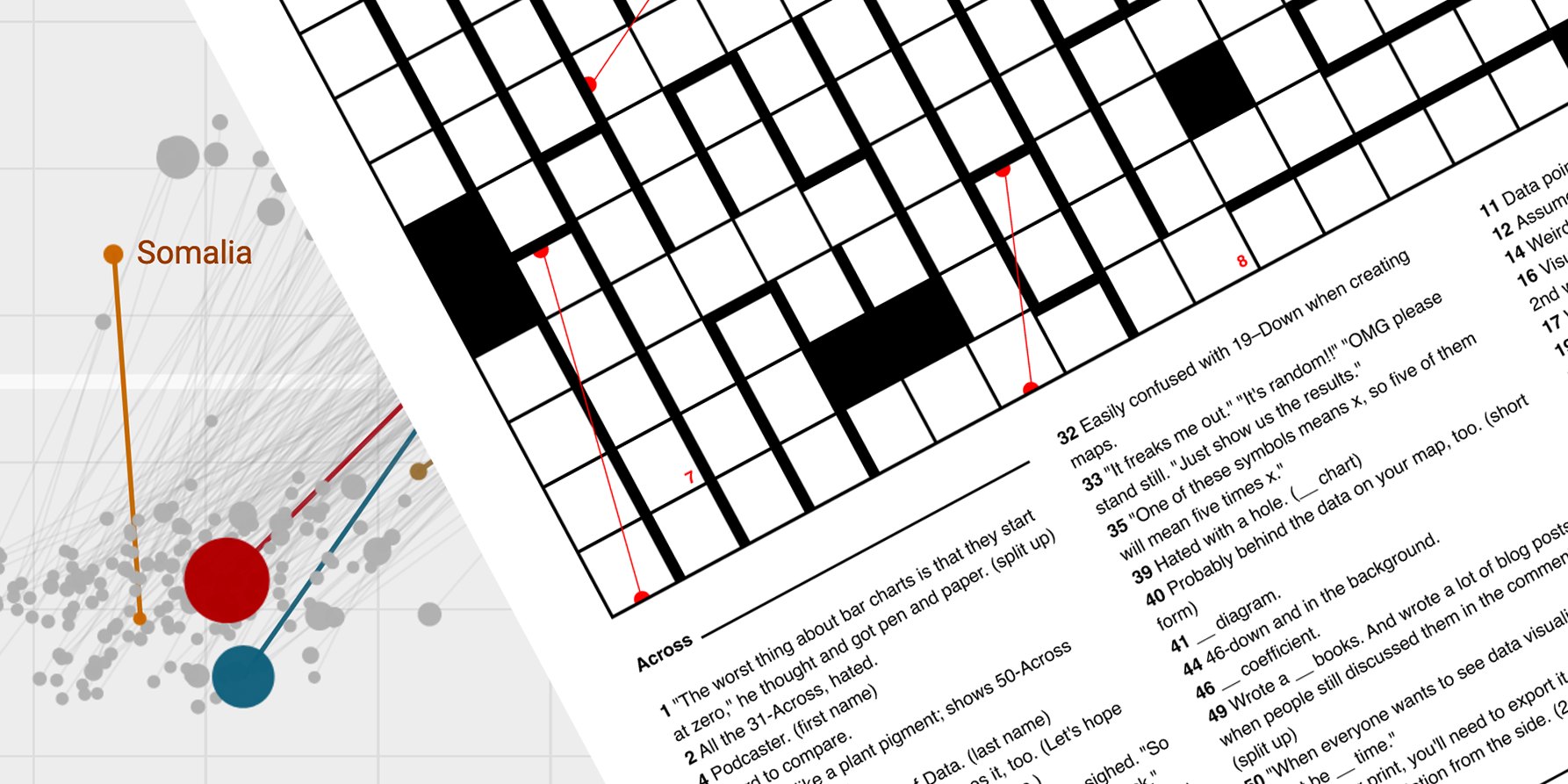
Charting Libraries. Gosh, there are so many out there. On Wikipedia and other websites, one can find a comparison of ca. 50 libraries – and these are only JavaScript libraries; not mentioning languages like Processing and libraries for Python and R. In the following blog post, I will try to get to know a few ones out of the great sea of possibilities. I want to understand their differences and how easy it is to learn them. To do so, I created the same bubble chart with twelve different frameworks. The chart and the underlying dataset I’ll use for that experiment are explained in the last post, “One Chart, Twelve Tools”.
I’m fairly new to most of these libraries. If there’s a better way to create the bubble chart than the one I used, or if I’m wrong about a thing or two, or if you completely disagree with my opinion about these libraries (which, I’m sure, will happen): Please let me know on Twitter or via email (lisacharlotterost@gmail.com), or as a pull request on Github.
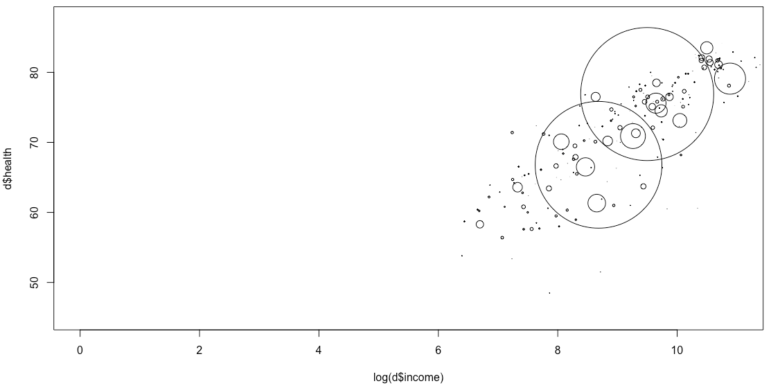
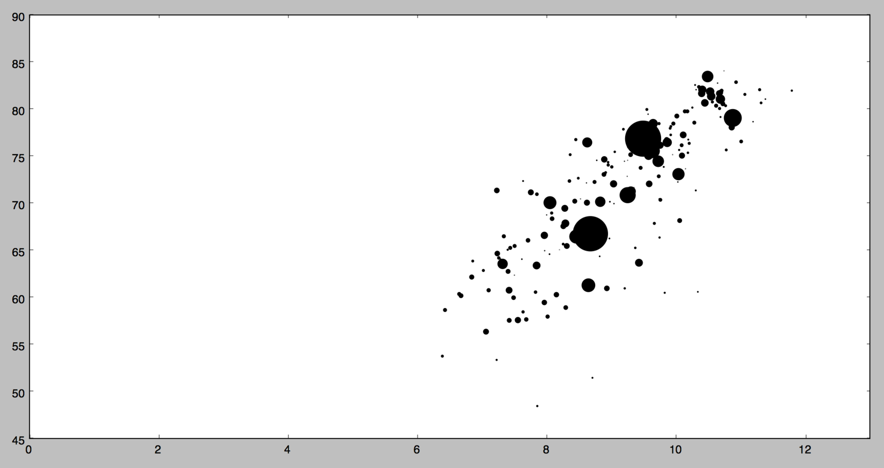
R – native R is the hippest statistical language around these days. Many data journalists all around the world feel an urge to learn it. Personally, it took me some time to understand the concept of data frames, but it’s totally worth it – especially when R is used with additional libraries like dplyr and ggplot2. But first, let’s look at creating plots with native R, without any libraries. It is possible; often it’s only a plot(d$income,d$health). But to create a bubble chart, we need the symbols function - FlowingData shows how.
#set working directory
setwd("Desktop")

#read csv
d = read.csv("data.csv", header=TRUE)

#plot chart, set range for x-axis between 0 and 11
symbols(log(d$income), d$health,circles = d$population, xlim = c(0,11))
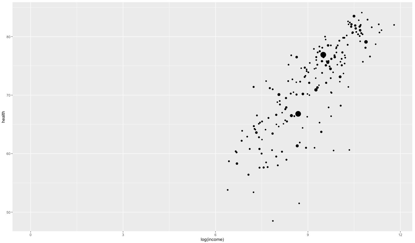
R – ggplot2 Native R is ok, but ggplot2 is where the fun begins. Again, it took me some time to get into it – especially because there is more than one possible way to write the ggplot2 command. But I’d consider ggplot2 one of the most flexible and at the same time easy to handle libraries out there.
#import library
library(ggplot2)

#set working directory
setwd("Desktop")

#read csv
d = read.csv("data.csv", header=TRUE)

#plot chart
ggplot(d) +
  geom_point(aes(x=log(income),y=health,size=population)) +
  expand_limits(x=0)
R – ggvis I’ve heard about ggvis only a few days ago. Similar to Bokeh, it tries to make interactive which wasn’t intended to be interactive: Ggvis’ graphics are built on Vega (a Javascript library built on D3.js). And its syntax is very similar to the one of dplyr, which I as a dplyr-Fan appreciate. I’m not sure if I’m a fan of the needed ~ before variables, though. And I couldn’t combine a log-scale with setting the domain of the x-scale to zero.
#import library
library(ggvis)
library(dplyr)

#set working directory
setwd("Desktop")

#read csv
d = read.csv("data.csv", header=TRUE)

#plot chart
d %>%
  ggvis(~income, ~health) %>%
  layer_points(size= ~population,opacity:=0.6) %>%
  scale_numeric("x",trans = "log",expand=0)
More R libraries which will produce JavaScript visualizations can be found on the htmlwidgets-Website. Juuso Parkkinen wrote a really good comparison of data vis libraries for R.
Python - matplotlib Matplotlib is the ggplot2 for Python: it’s a library for Python that makes building charts easier than Python does. I’m totally new to Python, so I found myself stuck in understanding how to import csv’s. For…hours. The Pandas library finally solved that problem for me. Also, I was surprised that I had to tweak the bubble size per hand. But from all the Python libraries I tried, matplotlib is definitely the easiest one.
#import libraries
import numpy as np
import pandas as pd
import matplotlib.pyplot as plt

#read data
data = pd.read_csv("data.csv")

#plot chart
plt.scatter(np.log(data['income']), data['health'], s=data['population']/1000000, c='black')
plt.xlim(xmin=0) #set origin for x axis to zero
plt.show()
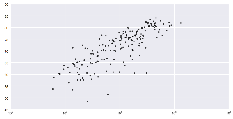
Python - Seaborn Seaborn is a library built on top of matplotlib. It is made for more statistical visualizations than matplotlib, and seems to be great every time you want to plot a LOT of different variables. For Non-statisticians, it might be overwhelming: There are two possible ways to create a scatterplot, and Seaborn defaults to drawing the regression model (aka “trendline”).
#import libraries
import pandas as pd
import matplotlib.pyplot as plt
import seaborn as sns

#read data
data = pd.read_csv("data.csv")

#plot chart
g = sns.regplot('income', 'health', data=data, color='k',fit_reg=False)
g.set_xscale('log')
plt.show()
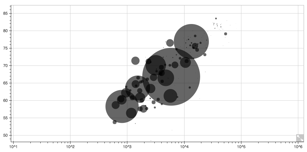
Python - Bokeh I found Bokeh really promising in the beginning – especially because it creates an HTML file and can be easily made interactive. It could be the perfect combination of a language for analysis (like ggplot2) and one for presentation (like D3.js). Personally, I’m disappointed that Bokeh uses Canvas instead of rendering SVGs. And I had some weird errors during my process.
#import libraries
import pandas as pd
from bokeh.plotting import figure, show, output_file

#read data
data = pd.read_csv("data.csv")

#plot chart
p = figure(x_axis_type="log")
p.scatter(data['income'], data['health'], radius=data['population']/100000,
          fill_color='black', fill_alpha=0.6, line_color=None)

#write as html file and open in browser
output_file("scatterplot.html")
show(p)
Great comparisons of more Python tools for data visualization can be found on Mode Analytics, Practical Business Python and Dataquest.
Processing
Processing is the entrance to the world of coding for many designers. The huge advantage of Processing? It is highly, highly flexible; as much or even more than D3.js - and at the same time it’s easier to understand and write. The disadvantage? It’s not made for data visualization. The processing coordinate system doesn’t start in the bottom left corner, but in the top left corner, so I had to invert the whole canvas. And axises are possible, but complicated. Also, the result is not made for the web. Javascript libraries like p5.js or Processing.js might solve that.
void setup() {
size(1000,500); #sets size of the canvas
background(255); #sets background color
scale(1, -1); #inverts y & x axis
translate(0, -height); #inverts y & x axis, step 2

Table table = loadTable("data.csv", "header"); #loads csv

  for (TableRow row : table.rows()) { #for each rown in the csv, do:

    float health = row.getFloat("health");
    float income = row.getFloat("income");
    int population = row.getInt("population");
    #map the range of the column to the available height:
    float health_m = map(health,50,90,0,height);
    float income_log = log(income);
    float income_m = map(income_log,2.7, 5.13,0,width/4);
    float population_m =map(population,0,1376048943,1,140);

    ellipse(income_m,health_m,population_m,population_m); //draw the ellipse
  }
}
D3.js
D3.js is without current alternative options when it comes to creating highly customized, interactive data visualizations for the web. But using D3.js for a simple bubble chart is using an orchestra to just play one tone, one instrument at a time. Sure, you used the whole orchestra. But you could have played Beethoven.
D3.js is a Javascript library with so few defaults that you need to define everything yourself. The disadvantage? Lengthy code. The advantage? It forces you to think about every single one of your settings. One example: Because in D3 I need to define all ranges and domains of scales myself, I was forced to think about the sizes of the bubbles - of all the languages in this blog post, only Processing wanted me to do the same.
<!-- mostly followed this example:
http://bl.ocks.org/weiglemc/6185069 -->

<!DOCTYPE html>
<html>
<head>
  <style>

  circle {
    fill: black;
    opacity:0.7;
  }

  </style>
  <script type="text/javascript" src="D3.v3.min.js"></script>
</head>
<body>
  <script type="text/javascript">

  // load data
  var data = D3.csv("data.csv", function(error, data) {

    // change string (from CSV) into number format
    data.forEach(function(d) {
      d.health = +d.health;
      d.income = Math.log(+d.income);
      d.population = +d.population;
      console.log(d.population, Math.sqrt(d.population))
    });

  // set scales
  var x = D3.scale.linear()
    .domain([0, D3.max(data, function(d) {return d.income;})])
    .range([0, 1000]);

  var y = D3.scale.linear()
    .domain([D3.min(data, function(d) {return d.health;}),
      D3.max(data, function(d) {return d.health; })])
    .range([500, 0]);

  var size = D3.scale.linear()
    .domain([D3.min(data, function(d) {return d.population;}),
      D3.max(data, function(d) {return d.population; })])
    .range([2, 40]);

  // append the chart to the website and set height&width
  var chart = D3.select("body")
  	.append("svg:svg")
  	.attr("width", 1000)
  	.attr("height", 500)

  // draw the bubbles
  var g = chart.append("svg:g");
  g.selectAll("scatter-dots")

    .data(data)
    .enter().append("svg:circle")
        .attr("cx", function(d,i) {return x(d.income);})
        .attr("cy", function(d) return y(d.health);})
        .attr("r", function(d) {return size(d.population);});
  });

  </script>
</body>
</html>

D3.js Templates
D3.js is complicated and waaay too flexible for 90% of all the charts that get plotted (or 99%? I’m making these numbers up). So some smart people thought: “Let’s use the power of D3.js and make it easy to plot the most common charts with it!” I call these add-ons D3.js template libraries. They are all Javascript libraries which require the D3 library. I tried the three ones I know of: C3.js, D4.js and NV3D.js.
When using C3.js, I first met the concept of “You have a csv that doesn’t look exactly the way we want our data? Nope nope nope, we won’t read that.” Meaning, my beloved csv got a strange side look from C3. Which then decided that it was unreadable.
Next, D4.js. I tried. I tried for almost an hour. I failed. My console in Chrome wasn’t showing any errors. I googled. Nothing. I gave up. That was the point where I learned that its crucial for programming languages to be documented well in the web to be usable. Edit: Mark Dagett, the creator of D4, published a way to build that chart with D4.
NVD3.js was better documented, and certainly more used than D4. NV3D.js too can only work with a very rigid data structure. But here, some help on the web let me read my CSV and produced a scatterplot. So half of my code was concerned with reading the data, but the other half looked like that:
...

nv.addGraph(function() {

    var chart = nv.models.scatter() //define that it's a scatterplot
        .xScale(D3.scale.log()) //log scale
        .pointRange([10, 5000]) //define bubble sizes
        .color(['black']); //set color

    D3.select('#chart') //select the div in which the chart should be plotted
        .datum(exampleData)
        .call(chart);

    //plot the chart
    return chart;
});
Highcharts.js
h, Highcharts. I make it short: I failed. I read through multiple Tutorials how to import a csv, and there seem to be multiple import options. Eventually, I could import the csv, but I couldn’t translate my data into a bubble chart.
What’s the problem, you ask? It seems like you can’t assign variables to axises. I couldn’t tell Highcharts to put the “health” variables on the y-Axis; the data needed to be in the right order in the csv in the first place. But if you, my fellow vis friend, go all that way and actually have the data in place - then Highcharts will be beautiful. You will get a good-looking chart with just a few lines of Javascript.
Btw, if somebody wants to help me with getting that bubble chart done in Highcharts - please reach out to me. I will be eternally grateful (terms and conditions may apply). Edit: The nice folks at Highcharts helped me to build that graph (see comments). The missing magic was a function called “seriesMapping”, which maps the columns (“0”,”1”, etc.) to the axises.
<!DOCTYPE HTML>
<html>
  <head>
    <script src="https://ajax.googleapis.com/ajax/libs/jquery/1.7.1/jquery.min.js" type="text/javascript"></script>
    <script src="https://code.highcharts.com/highcharts.js"></script>
    <script src="https://code.highcharts.com/modules/data.js"></script>
    <script src="https://code.highcharts.com/highcharts-more.js"></script>
  </head>
  <body>
    <div id="chart"></div>

    <script>
    var url = 'data.csv';
    $.get(url, function(csv) {

    // A hack to see through quoted text in the CSV
    csv = csv.replace(/(,)(?=(?:[^"]|"[^"]*")*$)/g, '|');

    $('#chart').highcharts({
      chart: {
        type: 'bubble'
      },

      data: {
        csv: csv,
        itemDelimiter: '|',
        seriesMapping: [{
          name: 0,
          x: 1,
          y: 2,
          z: 3
          }]
        },

        xAxis: {
          type: "logarithmic"
        },
        colors: ["#000000"],
      });
    });

    </script>
  </body>
</html>
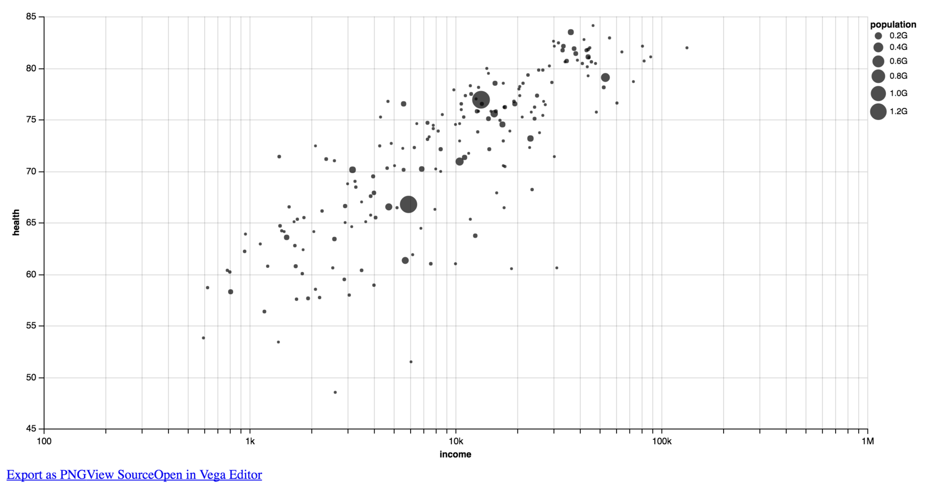
Vega One of the most important thing that came out of the University of Washington Interactive Data Lab is their “visualization grammar” called Vega, and its light brother, Vega-Lite. Vega feels like an as-much-in-depth charting library like D3.js, but is a little bit less flexible, I believe. It’s definitely easier to build charts with Vega then it is with D3.js. The JSON-structure (which forces you to set everything in quotes and curly brackets) is a little bit annoying, but besides that I’m positively surprised.
{
  "width": 1000,
  "height": 500,
  "data": [
    {
      "name": "data",
      "url": "data.csv",
      "format": {
        "type": "csv",
        "parse": {
          "income": "number"
        }
      }
    }
  ],
  "scales": [
    {
      "name": "xscale",
      "type": "log",
      "domain": {
        "data": "data",
        "field": ["income"]
      },
      "range": "width",
      "nice": true,
      "zero": true
    },
    {
      "name": "yscale",
      "type": "linear",
      "domain": {
        "data": "data",
        "field": ["health"]
      },
      "range": "height",
      "zero": false
    },
    {
      "name": "size",
      "type": "linear",
      "domain": {
        "data": "data",
        "field": "population"
      },
      "range": [0,700]
    }
  ],
  "axes": [
    {
      "type": "x",
      "scale": "xscale",
      "orient": "bottom"
    },
    {
      "type": "y",
      "scale": "yscale",
      "orient": "left"
    }
  ],
  "marks": [
    {
      "type": "symbol",
      "from": {
        "data": "data"
      },
      "properties": {
        "enter": {
          "x": {
            "field": "income",
            "scale": "xscale"
          },
          "y": {
            "field": "health",
            "scale": "yscale"
          },
          "size": {
            "field":"population",
            "scale":"size",
            "shape":"cross"
          },
          "fill": {"value": "#000"},
          "opacity": {"value": 0.6}
        }
      }
    }
  ]
}
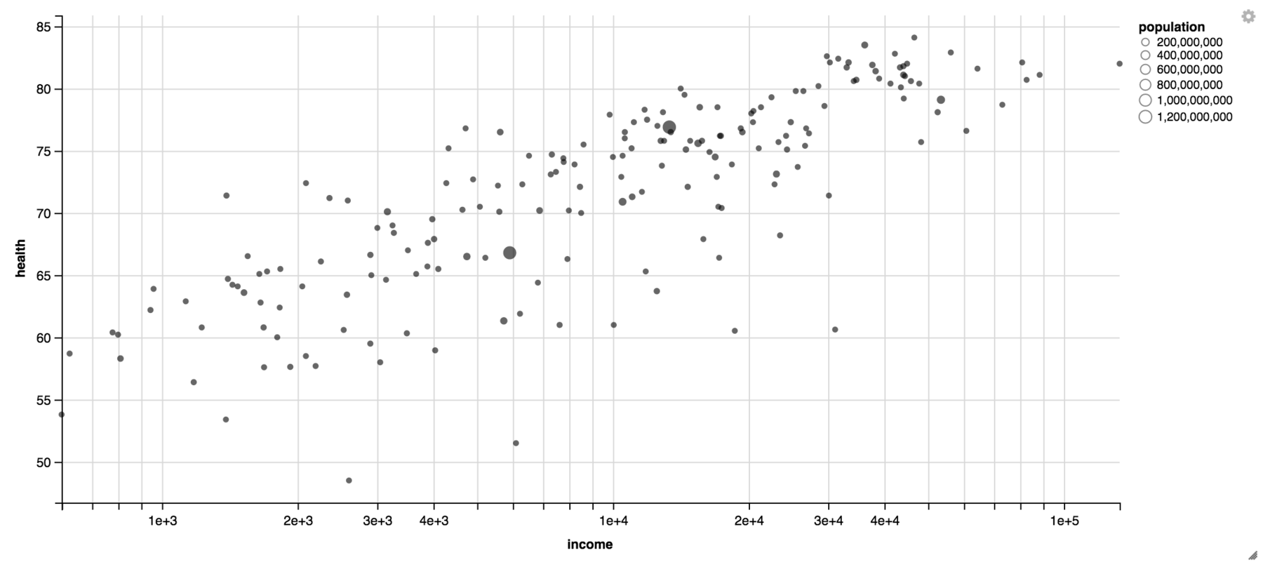
Vega Lite ….and here’s Vega Lite, the less complex & flexible than Vega, more high-level visualization grammar. Similar to Vega it has a JSON-like structure, but it sets so much more defaults. It seems amazing, but I couldn’t figure out a way to set the height and width of the whole chart. Edit: The Vega people showed me how to set the height and the width of the chart. Doesn’t seem suuuuper intuitive, but ok. The output looks exactly the same as it does with the Vega-Lite editor Polestar.
{
  "data": {"url": "data.csv", "formatType": "csv"},
  "mark": "circle",
  "encoding": {
    "y": {
      "field": "health",
      "type": "quantitative",
      "scale": {"zero": false}
    },
    "x": {
      "field": "income",
      "type": "quantitative",
      "scale": {"type": "log"}
    },
    "size": {
      "field": "population",
      "type": "quantitative"
    },
    "color": {"value": "#000"}
  },
  "config": {"cell": {"width": 1000,"height": 500}}
  }
If you want to try any of the code for yourself: The code for all these charting libraries can be found on GitHub. Let me know if you have questions about the code or how to run it!
The many hours spent trying to understand all these libraries were made possible by my Knight-Mozilla OpenNews fellowship at NPR. A big thank you to OpenNews, the NPR Visuals Team and the helpful comments at the GEN Data Journalism Unconference at the 10th of May in New York City.
———
Edit: After writing this blog post and publishing it on Twitter, I got some great, great responses. Everybody who took the time and replied with a hint, a link or with critique: Thank you so much! You made my knowledge greater and this blog post better. I learned about gnuplot, dimple.js and TauCharts (see comments). Jeff Clark reproduced this chart with Lichen and Austin did the same with Periscope Data – tools I’ve never heard before.
There was also a discussion about if the term “charting library” is appropriate for all tools in this post, initiated by Ben Fry. I’ve learned: It’s not appropriate. R or Processing are not libraries, but languages. And d3.js and processing.org are libraries, but not mainly made for charting. Guys, I’ve learned so much in the last couple of days. Thank you!


Comments