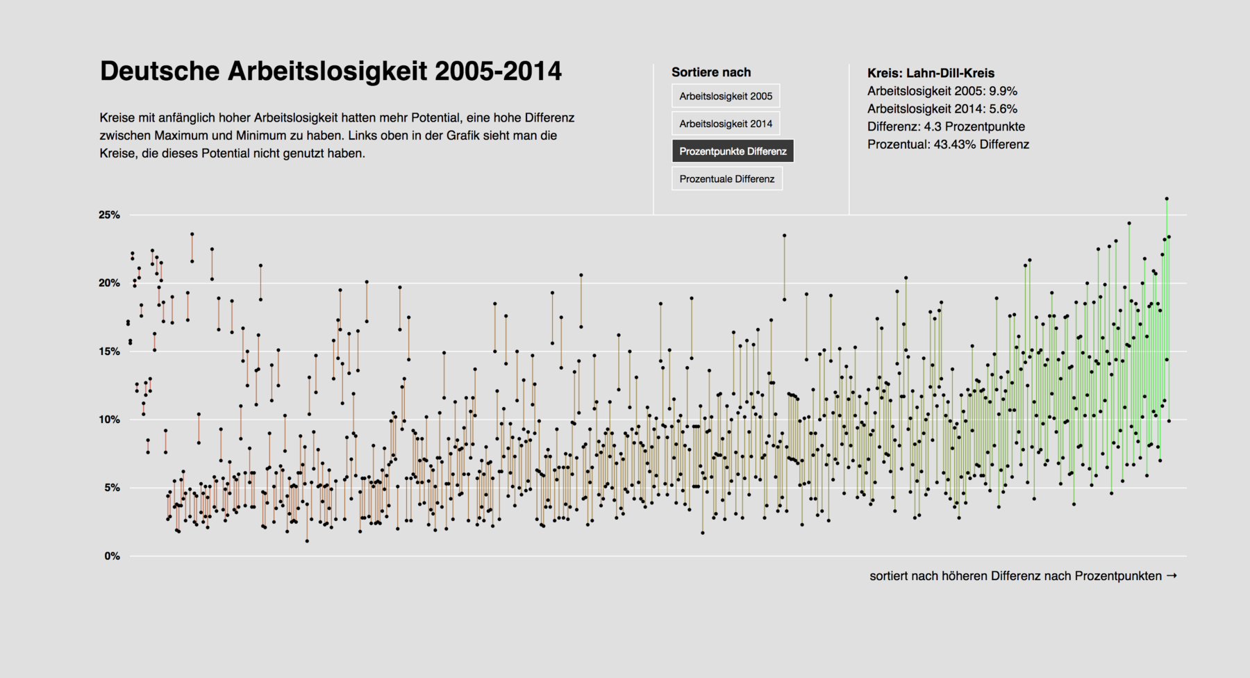
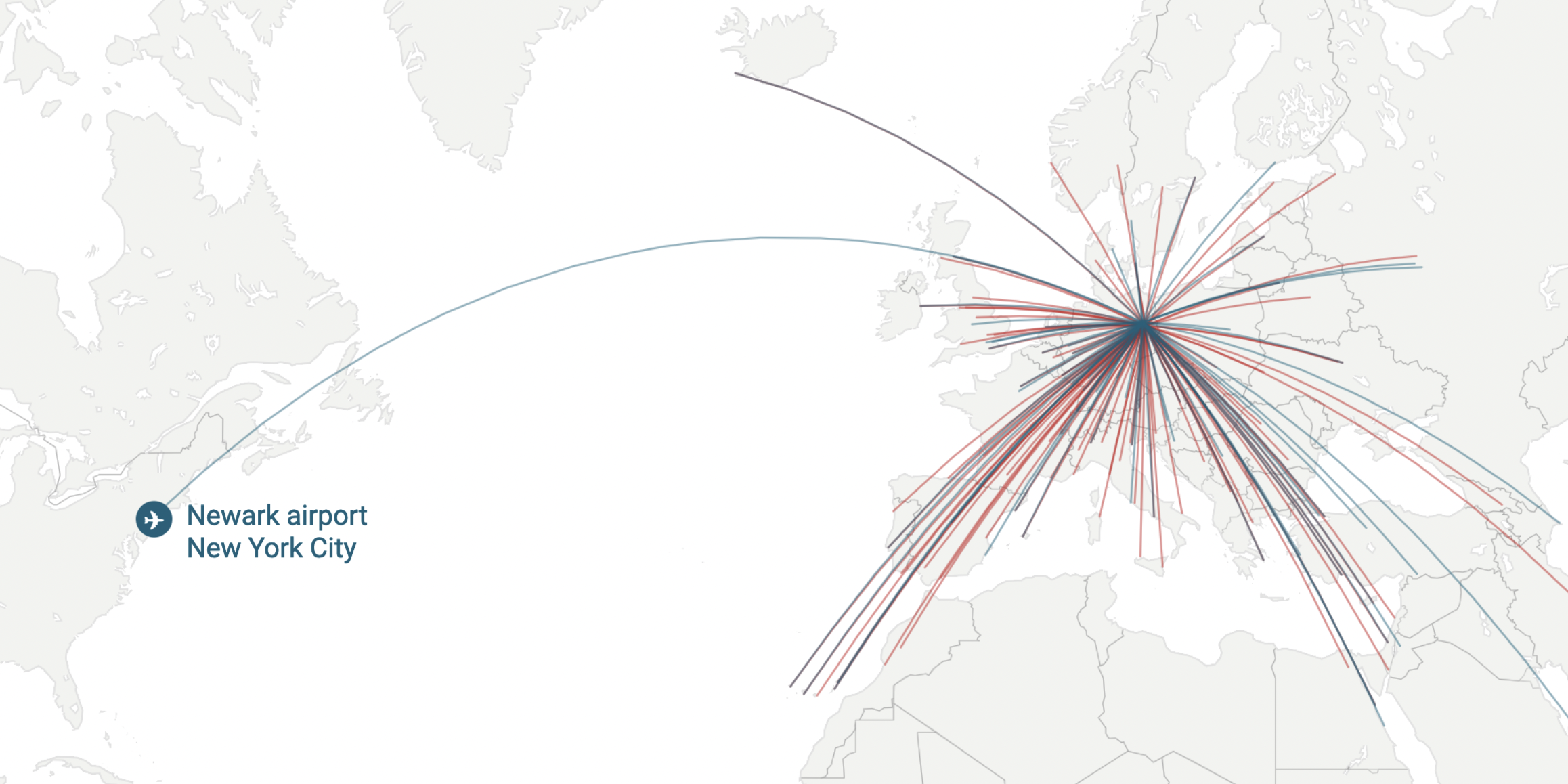
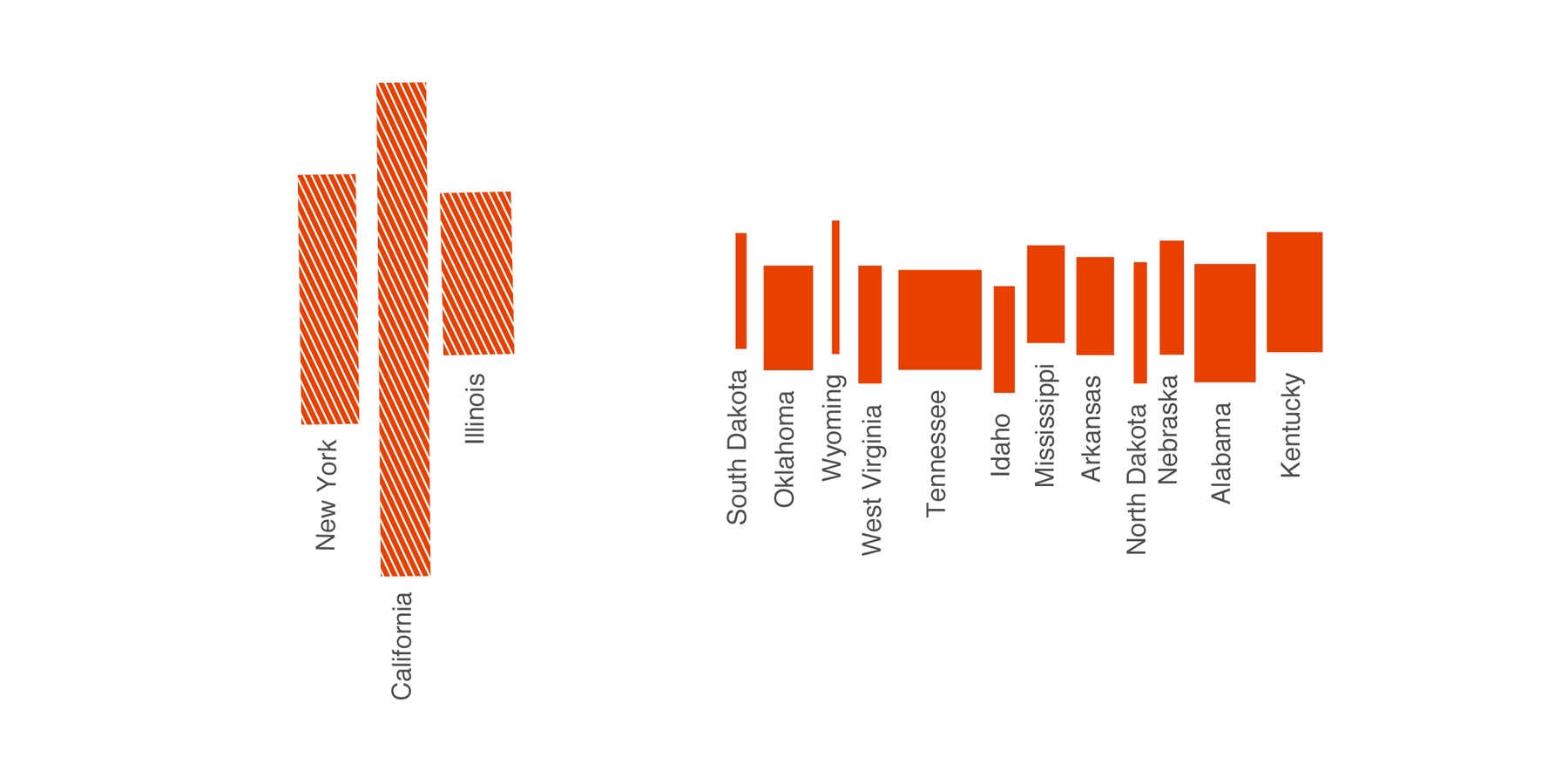
A few weeks ago I had a look at the drop of unemployment rates in Germany between 2005 and 2014 in an Adobe Illustrator graphic I built. I ended my post about it with the words: “Now, hover effects and sorting possibilities would be nice. Sigh. Well, I’m getting there.”
And I did get there. I proudly present the replication of this graphic in d3.js: Click here to get there.
And click here to see the Code on GitHub. And click here to see the data my graphic is built on. And click here to see the original graphic built by ZEIT Online, great people who also posted the data.
It is the first graphic in d3.js that I built alone and that I feel comfortable showing. It combines
- loading data from a csv and coercing d3 to understand the values as numbers
- creating groups with circles and lines
- coloring the lines depending to the data
- designing an axis
- setting tooltips as a hover effect
- setting buttons to trigger different sortings
- showing different text at different places, depending on the button clicked
That was the most complex coding experience I’ve ever had where I still understood what I’m doing. Meaning, I’ve always had the overview over what is happening why. That felt good.
This graphic is also totally not responsive and lacks some fine extras like a table at the bottom with the top and bottom values of each sorted graph or a way to keep lines highlighted (so that you can see how they change places when the sorting changes). Also, it’s missing a statement that I want the reader to understand (which is ok for a graphic that I built mainly for the purpose of practising). But well, again: I’m getting there.

Comments